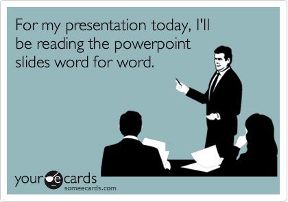
As a part of preparing our students for the world they are headed into, we should teach them how to make GOOD presentations. Slides full of text = BAD presentations!
Tips for most presentations:
- Use as little text as possible- tell us what we should to know
- No sentences (or nearly sentences), unless it's a quote- if we read it, we won't remember any of it
- Make images as large as possible
- Use a single large image instead of multiple small ones
- If using note cards, they should be in bullet point format and not scripted
- PRACTICE!!!!
Resources:
- Echo Rivera's You. Yes, you. You're using too much text on your slides
- Death by PowerPoint presentation
- Lifewire's How to Lose an Audience and 10 Ways to Get Them Back
- Lifehack's 6 Secrets of Bad Presentations and How to Avoid Them
- RenderForest's 10 Dos and Don'ts for an Effective Presentation
- Edutopia's 8 Tips to Power-up your Classroom Presentations
- Video: How to Give an Awesome Presentation
For Teachers:
To make it easier to grade, have students create and turn in 2 products:
- a Google Slides presentation (based on the tips above) that will be presented live in class, and
- a Google Doc that includes all of the content, research, sources, etc. that you're looking for in the rubric. You can quickly grade the content from that Google Doc and the audience won't be bored to tears with a bad classroom presentation.
Please see your DLC (Penney Matos at CHS) for additional tips and support!


No comments:
Post a Comment